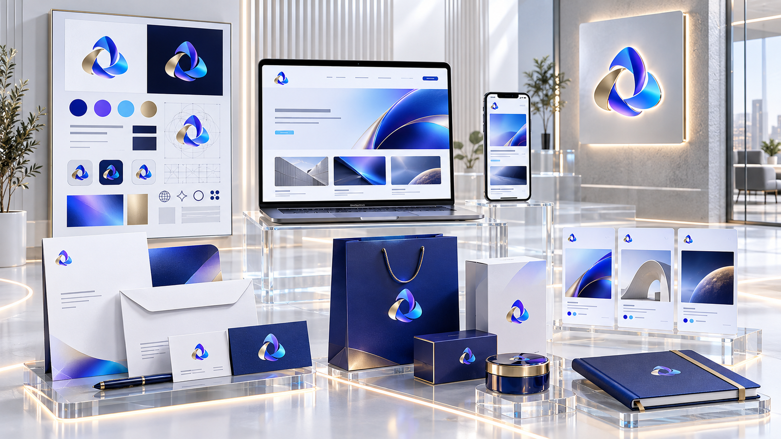
A visual identity is not just a logo or an attractive color palette. It is the visual system that makes a brand recognizable, expresses its personality and creates consistency across every customer touchpoint. When that system is built around a clear strategy, it becomes a practical business asset rather than decoration.
This guide explains the main components of a visual identity, the steps used to build one, the mistakes that weaken it and the tests that should happen before it is applied to a website, social media and printed material.
What does visual identity mean?
Visual identity is the visible language of a brand. It includes the logo, color palette, typography, icon style, photography direction, layout rules, spacing and the way those elements work together. Branding is broader: it includes the experience, reputation and expectations connected to the business. Good design cannot repair a weak service, but it can communicate value clearly and make the experience feel reliable.
Why consistency matters
- Recognition: repeated visual patterns help people remember the brand.
- Trust: consistency across the website, proposals and social content signals attention to detail.
- Personality: design choices show whether a brand is formal, innovative, friendly, practical or premium.
- Efficiency: documented rules and templates reduce production time.
- Growth: a flexible identity can expand into new channels without losing its character.

Start with brand strategy
Before opening a design application, define what the business offers, who it serves, how it is different and which personality it needs to communicate. Choose three to five useful traits such as dependable, modern, practical or approachable. Also identify where the identity will appear first: a corporate website, social platforms, packaging, presentations or a store.
The essential components
A flexible logo system
The logo should remain clear at large and small sizes, on light and dark backgrounds, and in horizontal or square spaces. Prepare a main version, a simplified version and a standalone symbol when required.
Color and typography
Define a primary color, supporting colors and neutral shades with accessible contrast. Select readable Arabic and English typefaces when the brand is bilingual, then document sizes and roles for headings, body copy and buttons.
Images, icons and layout
Decide whether the brand uses photography, illustration or 3D visuals, and whether icons are outlined or filled. Define spacing, alignment, card shapes and reusable layouts so new material still feels related.
A practical identity-building process
- Research the audience, market and competitors.
- Define a creative direction linked to the brand strategy.
- Develop and compare more than one concept.
- Build the color, type, image and layout system.
- Test readability, contrast and flexibility across real applications.
- Document the rules and deliver organized files.
Common mistakes
- Designing a logo before understanding the audience.
- Copying a competitor instead of building a distinct position.
- Using too many colors and fonts without clear roles.
- Focusing on appearance while ignoring readability.
- Delivering a logo without templates or usage rules.
- Changing style from one channel to another.
How do you know the identity is ready?
Test it in a website header, mobile screen, social profile, proposal, business card and packaging when relevant. The logo should stay clear, text should remain readable and another designer should be able to produce new material by following the rules. If every new application requires a completely new look, the system still needs refinement.
Explore examples in our portfolio, or talk to Tamayoz about your brand.